An ode to Toronto and women's soccer. Co-designing this crest for AFC Toronto's Supporters' Group with Cat Chiodo and the whole Vermilion Vanguard community was easily one of my favourite design projects.
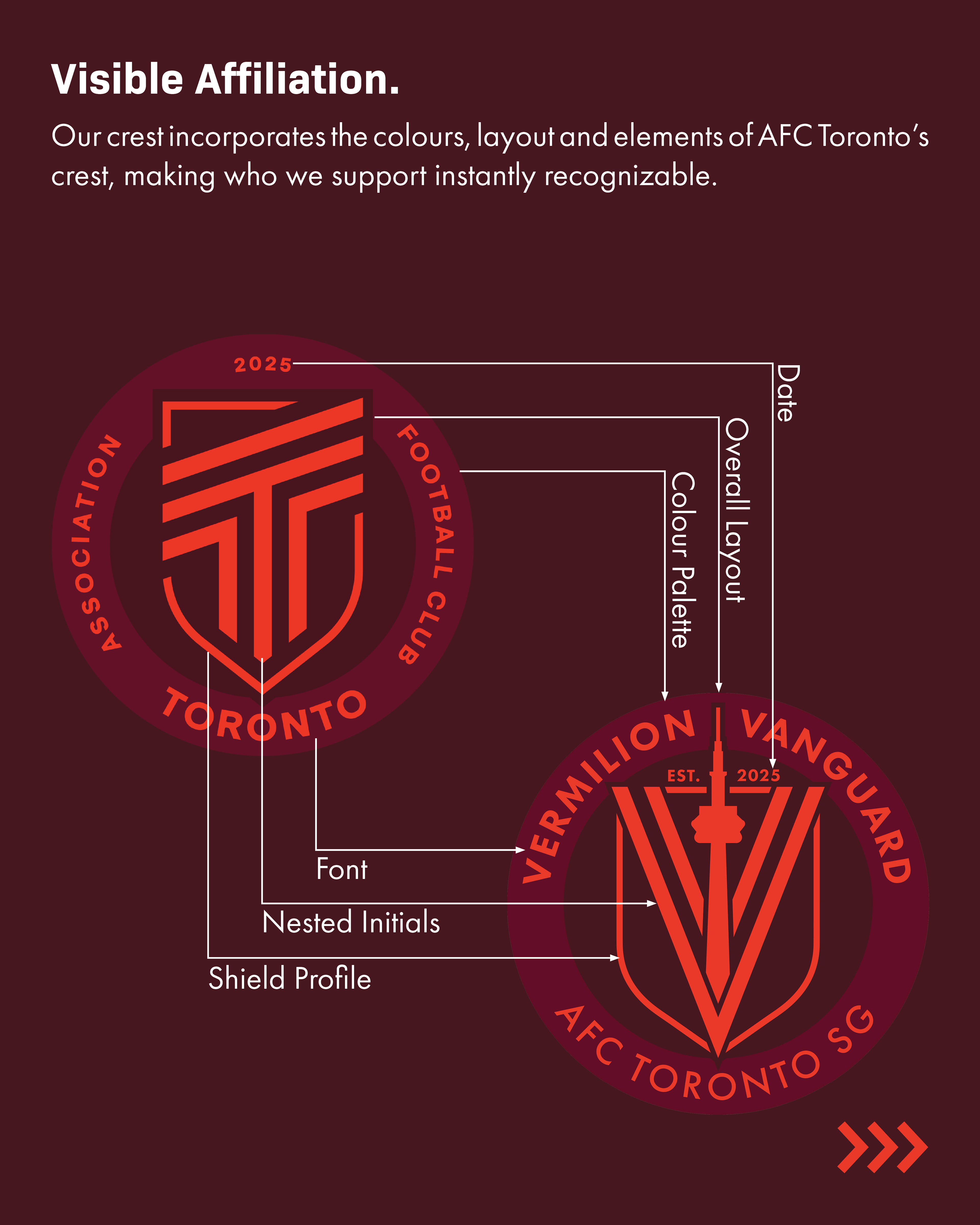
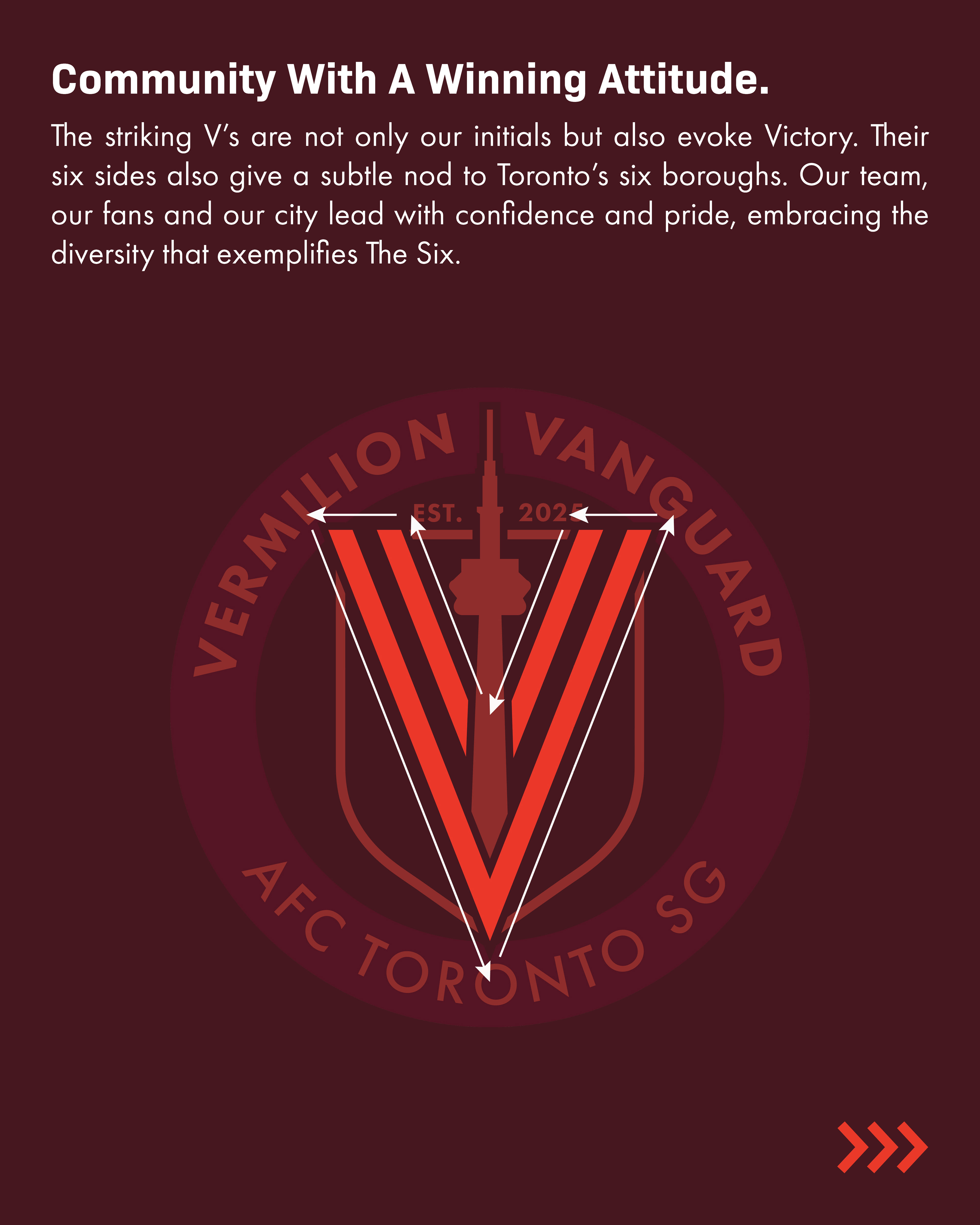
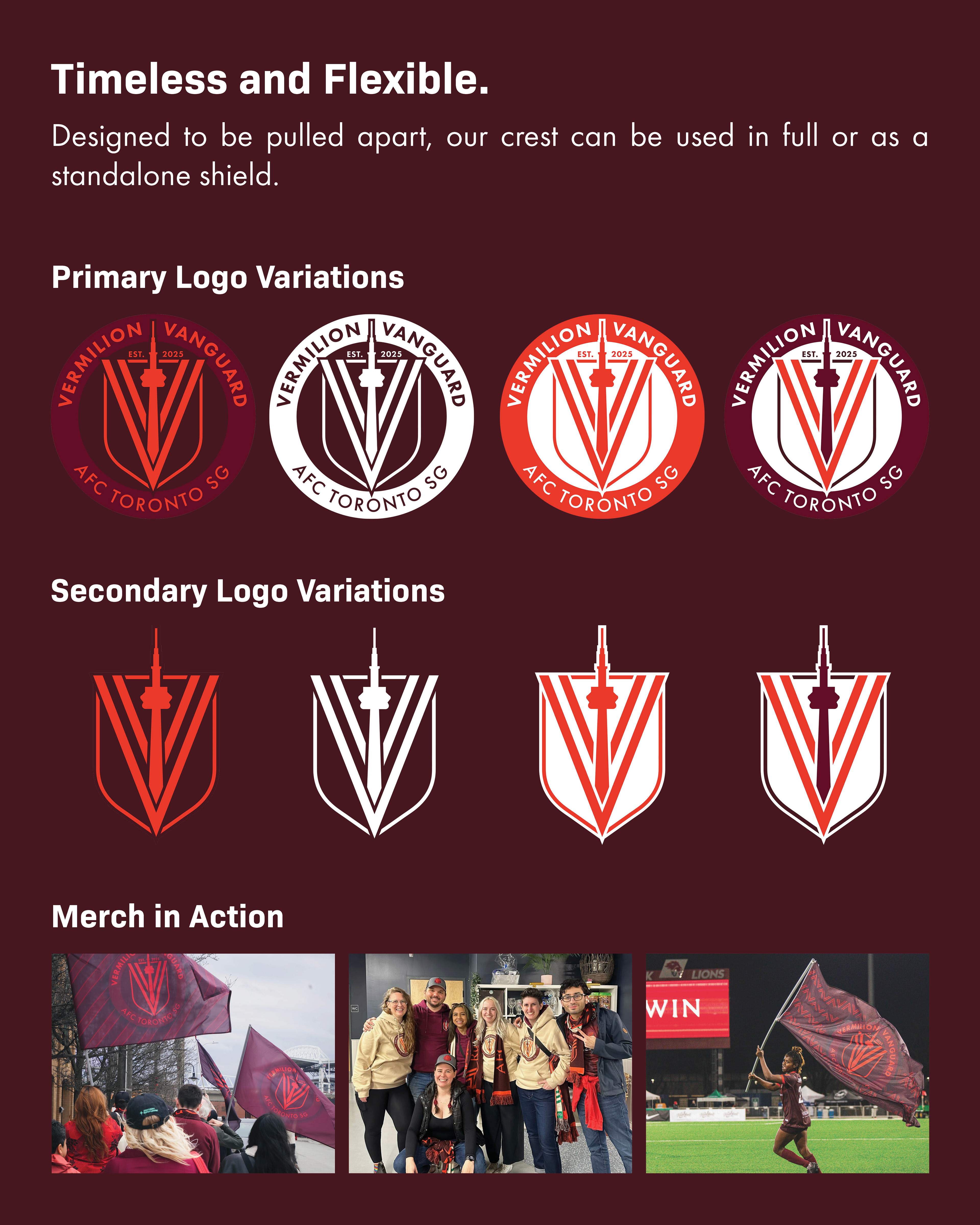
From the beginning, we knew we wanted something instantly recognizable as being tied to AFC Toronto and our city. Our crest mimics the club's by incorporating the same colours, layout, nested letters and shield profile.
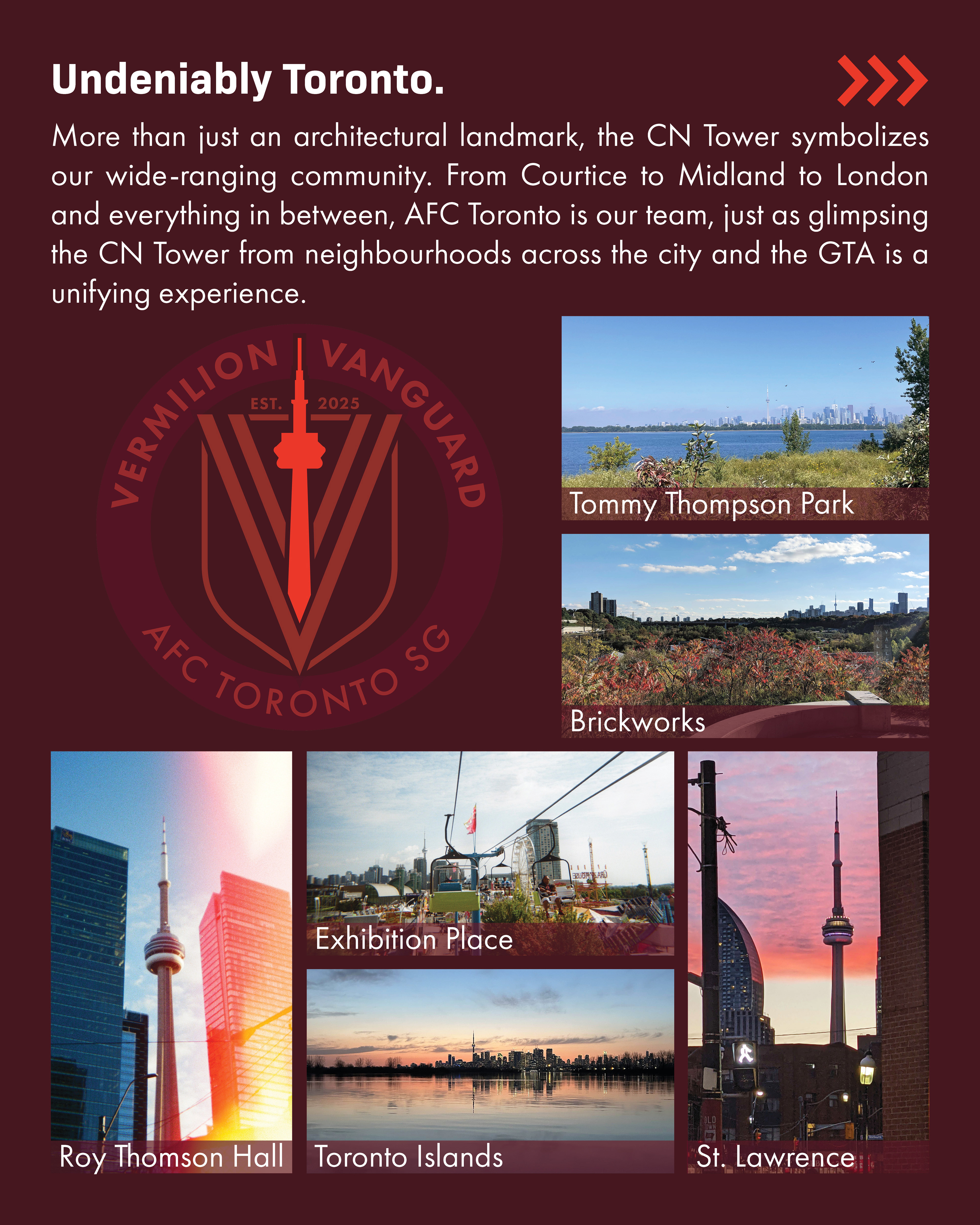
My favourite element, though, is our addition of the CN Tower, since it's always been more than just a tower or physical symbol of Toronto to me. It represents Toronto's diverse communities. From hearing my parents' stories of watching it get built from their elementary school classrooms to catching glimpses of it from neighbourhoods across the city and GTA, it's a singular landmark that ties together the area's generations and communities. No matter who you are or where you are, the CN Tower is a cultural touchpoint– just like AFC Toronto and the Vermilion Vanguard are and will be for Toronto's women's soccer community.
From the beginning, we knew we wanted something instantly recognizable as being tied to AFC Toronto and our city. Our crest mimics the club's by incorporating the same colours, layout, nested letters and shield profile.
My favourite element, though, is our addition of the CN Tower, since it's always been more than just a tower or physical symbol of Toronto to me. It represents Toronto's diverse communities. From hearing my parents' stories of watching it get built from their elementary school classrooms to catching glimpses of it from neighbourhoods across the city and GTA, it's a singular landmark that ties together the area's generations and communities. No matter who you are or where you are, the CN Tower is a cultural touchpoint– just like AFC Toronto and the Vermilion Vanguard are and will be for Toronto's women's soccer community.
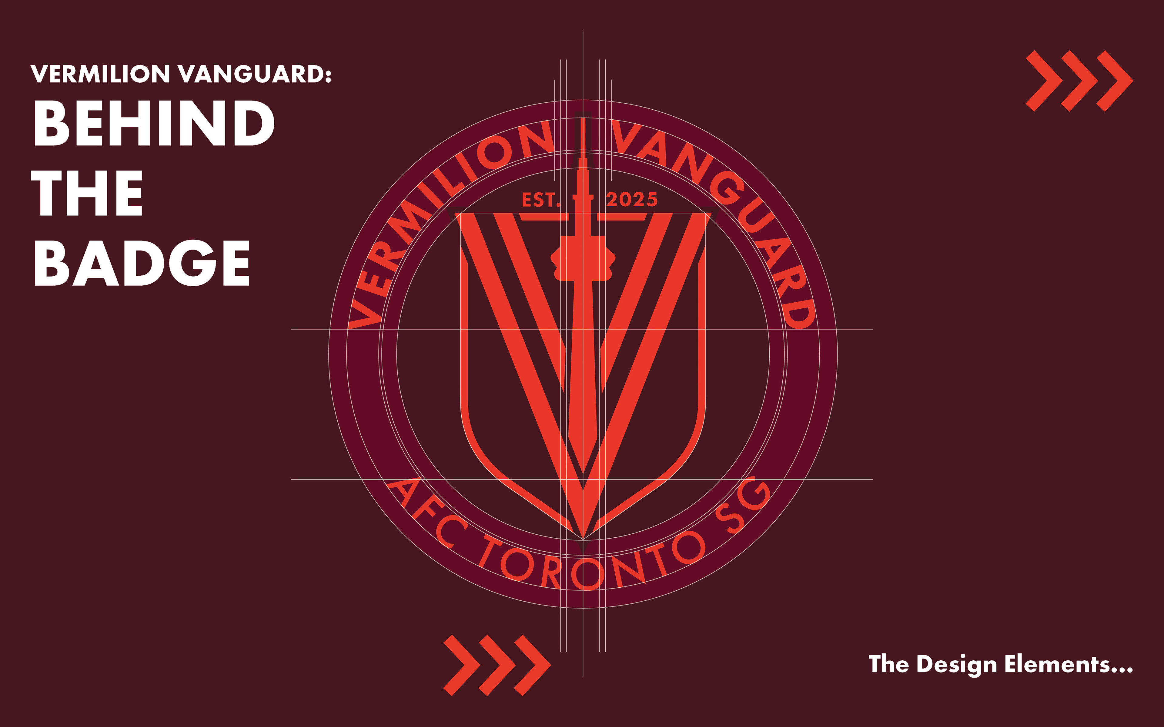
Final Crest Design Background.